Note – The following guest post is written by Owen Xia, one of the trainers for Happy Marketer’s course on covering everything related to User Experience & Design and applying it to Digital Marketing channels like Websites, Mobile Apps, Mobile Sites, Digital Advertising, Social Media and Content Marketing. Call (+65) 6653 8065 or email Training@HappyMarketer.com for more information or registration.
Have you ever noticed how some parents seem to be totally oblivious to their children’s misbehavior in public? Sometimes you think they’re blind to every negative quality of their kids.
It’s a lot like that when it comes to judging your company’s own website. The more you look at your own company’s website, the more you tend to ignore any design defect it may have. Sometimes, you really need a pair of outside eyes to point out the obvious to you.
Thankfully, most marketers and designers in Singapore are savvy enough to avoid the most obvious forms of these mistakes. But we still regularly meet non-marketers (Sales Folks, CEOs, Directors, Offline Marketers) who don’t grasp digital well, and would easily launch one of these designs.
Here are our “top list” of the easiest web design/usability mistakes that you can avoid:
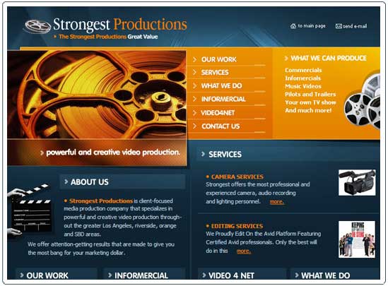
Outdated Look and Feel
If your website still looks like it was designed in the last century, by a high school student, with bad choice of layout, screaming colors, drop-down shadows, gradients and all, then you probably shouldn’t be reading this.
Fortunately, we almost never see such websites any more in Singapore.

The site above may be taking things to the extreme, but a lot of common “look and feel” problems can be found here:
- Image Headline instead of Text Headline (which is also bad for SEO)
- Loud & Busy Backgrounds (we don’t mind gorgeous photos, but gradients are bad)
- Centre Justified Content rather than Left Justified
Not Explaining What You Do In Plain English
If the headline and introduction read like an excerpt what a scientific journal, then there’s something seriously wrong, unless, you do have science journal website that only scientists read.
It happens so often that after browsing for a couple of minutes we’d still not know what the company does. The “home” and “about us” sections often appear to be taken straight from some hypnotic affirmations, and readers are more lost after reading them than to begin with.
The fact is, your readers don’t have time for you. You need to tell them, in the simplest words (without sounding like patronizing), why they should care about what you offer.
But don’t go from one extreme to the other. Don’t just say “welcome to …” That is plain English enough, but that practice was even old in 1999, as it doesn’t add any value whatsoever to your website. The first thing your visitors see must be the most important thing you have to say. Remember, the first screen (“above the fold”) can make or break a website.

Poor Readability, No Scannable Text
On a related note, some websites have good content, but are so cluttered that visitors’ headache as a result of it prevents them to read further.
You need to have scannable text in place. Group your content under meaningful sections and headings so that it’s easier for readers to navigate through your content.
Also, try to avoid fancy fonts if they take away the focus or doesn’t match the overall UI design.

There are many subtle elements that make up a great design, and beyond Fonts and Backgrounds, here are some problems with the example above:
- Three Columns (Plus Navigation) is way too much information to digest
- Gradients and Variations of Yellow (which is an strange colour anyway)
- Lack of alignment between logo and tagline

Too Many Massive Images
The current design trend seems to be a splash image with a bold headline across it. That’s fine. But make sure the images on your website don’t steal the focus from the actual content (unless you’re Pinterest).
Plus, too many images slow down the website. Although the Internet speed is fast for the average visitor, there are still plenty of websites that take more than 5 seconds to load, pretty much near the patience limit of most people.
The design (or UI) of your website ultimately serves the content. You don’t want people to walk away thinking, “That was a beautiful design, but what do they do exactly?”
Poor Navigation and Site Structure
Many websites seem to employ both horizontal and vertical site navigation on the same page (or worse, navigation that doesn’t look like navigation). This could cause some serious usability issues, as visitors don’t know where to click.
Your website structure must be clear to both a user and Search Engines. That means all or most of your content should be within 3 levels down the home page, and there should be a sitemap included at the bottom.
And visitors should be able to get from one page to another page quickly, instead of pressing the back button a few times. If not, they’d probably move on to your competitor’s site.

Even if your website appears relatively “clean” in the example above, and the structure is clear, visitors may still feel alienated if it is so far from today’s Web 2.0 (or even Web 3.0) standards. Here are some problems with the example above:
- Lack of any headlines or sub-headlines in the main content section
- Un-intuitive Navigation items (Welcome instead of Home)
Too “Flashy”
First of all you should have flash on your website anymore. With the development of modern Javascript and HTML5, it’s pretty much a dead technology.
“Flashy” also means too many font styles and colors, too much animation and special effects.
It’s a good thing if your website has a “wow” factor (especially if you’re in a creative industry) but too much of any good thing could turn out to be bad.
No Mobile-Friendly Screen Resolution
It’s no longer news that most people (especially in Singapore) browse the Internet with mobile devices as much as they do on desktops (just look around the MRT and you’ll get an idea).
And don’t just assume your website “looks fine” on a smartphone or pad.
Statistics show that 75% of smartphone users prefer a mobile friendly websites but 96% say they’ve encountered sits that are not designed for mobile devices (duh!), and we hope your website is responsive so that visitors don’t have pinch or drag furiously to read what you have to offer.
It’s very easy to find out how you’re doing on this from your Google Analytics account. Find out the percentage of visitors on mobile devices and their average time on site.

No Call-To-Action
This probably has more to do with copywriting than with web design, but from a UX (User Experience) point of view, it really is the last step of the entire experience.
You want to conclude the relationship between your website and visitors by asking them to perform a specific action, either to download something, buy something or contact you. That’s where Call-To-Action comes in.
Essentially, you want to tell your visitors exactly what to do, without assuming they’d take the initiative on their own, such as “click on the share link below right now to share it on your Facebook”.

Hope you enjoyed these quick tips, and hope that you’re able to avoid these mistakes in your next design. If you’d like to learn more about User Experience & Design and applying it to Digital Marketing channels like Websites, Mobile Apps, Mobile Sites, Digital Advertising, Social Media and Content Marketing. make sure you sign up for our next course on the topic. Call (+65) 6653 8065 or email Training@HappyMarketer.com for more information or registration.


